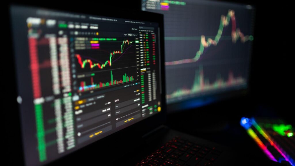
Crypto research platforms pull scattered numbers – exchange prices, on-chain transfers, supply schedules, funding rates – into one view, so an investor can answer three questions in minutes instead of an afternoon: is this asset liquid, is the network actually used, and who holds the supply? That’s the whole pitch. Less tab-switching, fewer copy-paste spreadsheets, and a repeatable method you can run again next week and get comparable answers.
What crypto research platforms actually do
These are aggregators that keep receipts. They pull crypto price data straight from exchange APIs, index transactions through their own nodes (or rented ones), and bolt that onto the paperwork side: vesting calendars, treasury wallets, token documentation. The unglamorous work is normalization. Two exchanges will quote the same pair with different tick sizes and timestamps, and someone has to reconcile that – otherwise your chart is off by a few seconds and you never notice.
The practical difference shows up on a noisy night. When a mid-cap token jumps 30% at 2 a.m., a dashboard from a service such as ProvenCrypto lets you check whether the move came with real volume across several venues or one thin order book – before the story reaches your feed.
The four data layers that matter
Most confusion comes from mixing layers. A wallet chart can’t tell you about liquidity, and a candle can’t tell you who is selling. Keep them separate.
|
Data layer |
The question it answers |
|
Market data |
What price, what spread, how deep is the book? |
|
Blockchain analytics |
Who moved coins, when, and to which exchange? |
|
Project fundamentals |
What is the supply schedule and who unlocks next? |
|
Sentiment and flows |
Where is attention and leverage building? |
How investors read crypto market trends without guessing
Here is a small calculation worth doing by hand. Suppose a token reports $40 million in daily volume, but the order book holds only $600,000 within 2% of mid-price. That puts reported volume at nearly 67 times the depth that would actually absorb your exit. Treat the ratio as a sanity check rather than a formula: volume is a full day of flow, depth is a snapshot of one moment. A $50,000 position is fine. A $500,000 position turns into a slow-motion problem the day you want out.
Good crypto research platforms show both figures on the same panel, which is exactly why they beat a lone price chart. Combine that with cryptocurrency metrics like active addresses and fee revenue, and crypto market trends stop looking like vibes and start looking like a spread of measurements that either agree or don’t.
A checklist for judging crypto price data
Every dashboard looks authoritative. Clean typography, a decimal point in the right place, a green arrow – none of that tells you where the number came from. I found this out comparing one token across three services on a Sunday morning and getting three different market caps. Nobody was lying. Each counted supply its own way, and only one of them mentioned it, in a footnote you had to hover over.
So ask what a figure measures before it earns a place in your thesis. The analysis is usually fine; the input it rests on quietly meant something else. Two minutes of interrogation up front saves the reconstruction later. Run through the list below whenever you meet a new asset, or a familiar one on a new platform:
- Which venues feed the price, and is a single exchange quietly dominating the average?
- Is volume filtered for wash trading, or is it raw exchange self-reporting?
- Does circulating supply subtract locked team, investor, and treasury allocations?
- What is the refresh lag – live, five minutes behind, or yesterday’s close?
- Are bridged and wrapped versions of the asset counted once, or twice?
Where research platforms still fall short
Nobody should treat a dashboard as an oracle. The most common failures I see are quiet ones, not dramatic ones.
|
Metric |
Common misreading |
|
Active addresses |
Airdrop farming inflates it for weeks after a campaign |
|
Exchange inflows |
Internal wallet reshuffles look like selling |
|
Market cap |
Built on circulating supply, so it says nothing about pending unlocks – read it next to fully diluted valuation |
Wallet labels age badly, too. An address tagged as an exchange hot wallet two years ago may now belong to a custodian, and every “whale deposit” alert built on that label is wrong until someone re-tags it.
Making sense of the numbers: a practical workflow
- Start with liquidity: depth, spread, and venue concentration.
- Check supply: unlock dates in the next 90 days.
- Open blockchain analytics: transfer counts and holder concentration.
- Compare against two peer assets on identical timeframes.
- Write your thesis in one sentence, with the number that would break it.
Research platforms for crypto don’t remove risk. What they buy you is the half-hour between seeing a claim and being able to check it – and that half-hour is usually the difference between sizing a position and regretting one.